Sunday, 12 May 2013
More on typography
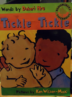
I have been looking at a selection of children's books for ideas on typography. This book Tickle Tickle by Dakari Hru, has hand rendered text on the cover and inside which harmonizes with the line work of the illustrations by Ken Wilson-Max.
This book from the Stinky Face series by Lisa McCourt has a combination of normal text and hand rendered text that interacts with the illustrations. Below is an example of this.
Oliver Jeffers, How to Catch a Star, also has a very hand rendered text which works well with his simple, but very clever illustrations.
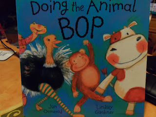
Jan Omerod's Doing the Animal Bop also has lovely typography that works beautifully with the rhythm of the text; increasing and decreasing, bold and normal and is also at different angles depending on the scene.
When they write the word 'WADDLE,' (see right) it actually looks like it is waddling.
In Panda Big and Panda Small Jane Cabrera uses standard fonts but they increase and decrease to emphasise the opposite words that they are highlighting.
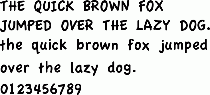
I will be using Adobe Illustrator to add the text to my pages. After trying out a few different fonts I decided on Apple Casual:
This sort of font is very similar to a child's first letters and so is familiar to the reader.
The typography of the cover title is hand rendered in the style of narrow boat art but the book blurb on the reverse side is done in Apple Casual to match in with the font inside the book.
Saturday, 11 May 2013
Typography
TYPOGRAPHY
Playful typography from Coriander the Contrary Hen, by Dori
Cahonas.
Sara Fanelli’s typography is mainly hand rendered and works
well with her books and art work.
Below is a clever play with typography by a graphic art
student from Bristol, Hannah Boland.
I have tried using my typography separate to the picture, but this did not work so well. I have therefore decided to incorporate the typography for the narrative onto the actual colour dps and add the activity suggestion behind the flap. Doing it this way gives continuity to the story and helps a younger child follow the pattern, as this is how young minds work.
When considering what font to use I have been looking for a simple font that is easy to read/child friendly and helps youngsters that are new at reading skills. The words are simple without being condescending, as children are intelligent and do not like being talked down to.
At this stage children would most probably still have adult support in reading and as the activity is outside the home they would definitely have adult supervision. I would also add a warning page at the start of the story, especially as canal walks should always be accompanied by an adult/responsible person.
I am looking at this font as a possibility or one very similar as I think the simple 'a's and 'g's work well in a children's book.
Berlin Sans FB Demi
‘a’ ‘g’
Friday, 10 May 2013
Cover page
Here are some preliminary sketches for my cover, using the canal boat books borrowed from the library.
I have used the canal art on my front cover as this is a very familiar sight on our canals. I mimicked the type of typography used on the lettering on canal boats as the title of my cover. This brings in the whole theme of the canal and is also a bright eye-catching cover that would stand out on a shelf and be appealing to children. The title Come Explore, also invites a child both into the book and to make a journey like the protagonist in the book, Sam the cat.
Tuesday, 7 May 2013
Two pages in full colour.
First page...just in the middle of adding text and the flap. I have decided to add a suggested activity on the flap, 1 per DPS. The flap will cover the drake.
Here Sam the cat stops to speak to the drake, while the duck is feeding.
This is my second page. Sam sees a mouse and jumps off the canal boat to investigate. The flap will cover the mouse.
On each of the pages there are other things to spot: a buttercup and ladybird on the first page and a poppy, dragonfly and pigeon on the second.
There will be an information page at the back, which would give a little information about the plants, animals and minibeasts that are featured throughout the book.
Typography will be added on Adobe Illustrator. I am considering a simple san serif font as this is easy for the younger age range that I am aiming my book for. 5-6 year olds.
Thursday, 2 May 2013
Further development of my DPS
Lift the flaps ideas on the first double page spread.
Ideas for additional pages: How to make a model of a canal boat with card and use this to keep some of your findings from your canal walk.
Ideas of things you can find on your canal walk and what you can do with your finds when you get home.
More ideas of things to do on your walk. eg. taking a sketch book with you, take a camera, rubbings using crayons etc.
Books I used for reference for my second double page spread.
Adding colour to the first pages.
Subscribe to:
Posts (Atom)