Sunday 12 May 2013

More on typography


I have been looking at a selection of children's books for ideas on typography. This book Tickle Tickle by Dakari Hru, has hand rendered text on the cover and inside which harmonizes with the line work of the illustrations by Ken Wilson-Max.


  This book from the Stinky Face series by Lisa McCourt has a combination of normal text and hand rendered text that interacts with the illustrations. Below is an example of this.


Oliver Jeffers, How to Catch a Star, also has a very hand rendered text which works well with his simple, but very clever illustrations.


 Jan Omerod's Doing the Animal Bop also has lovely typography that works beautifully with the rhythm of the text; increasing and decreasing, bold and normal and is also at different angles depending on the scene.
 When they write the word 'WADDLE,' (see right) it actually looks like it is waddling.


In Panda Big and Panda Small Jane Cabrera uses standard fonts but they increase and decrease to emphasise the opposite words that they are highlighting.


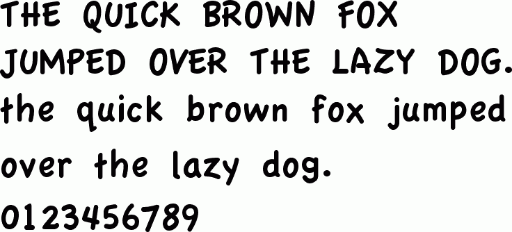
I will be using Adobe Illustrator to add the text to my pages. After trying out a few different fonts I decided on Apple Casual:


This sort of font is very similar to a child's first letters and so is familiar to the reader.

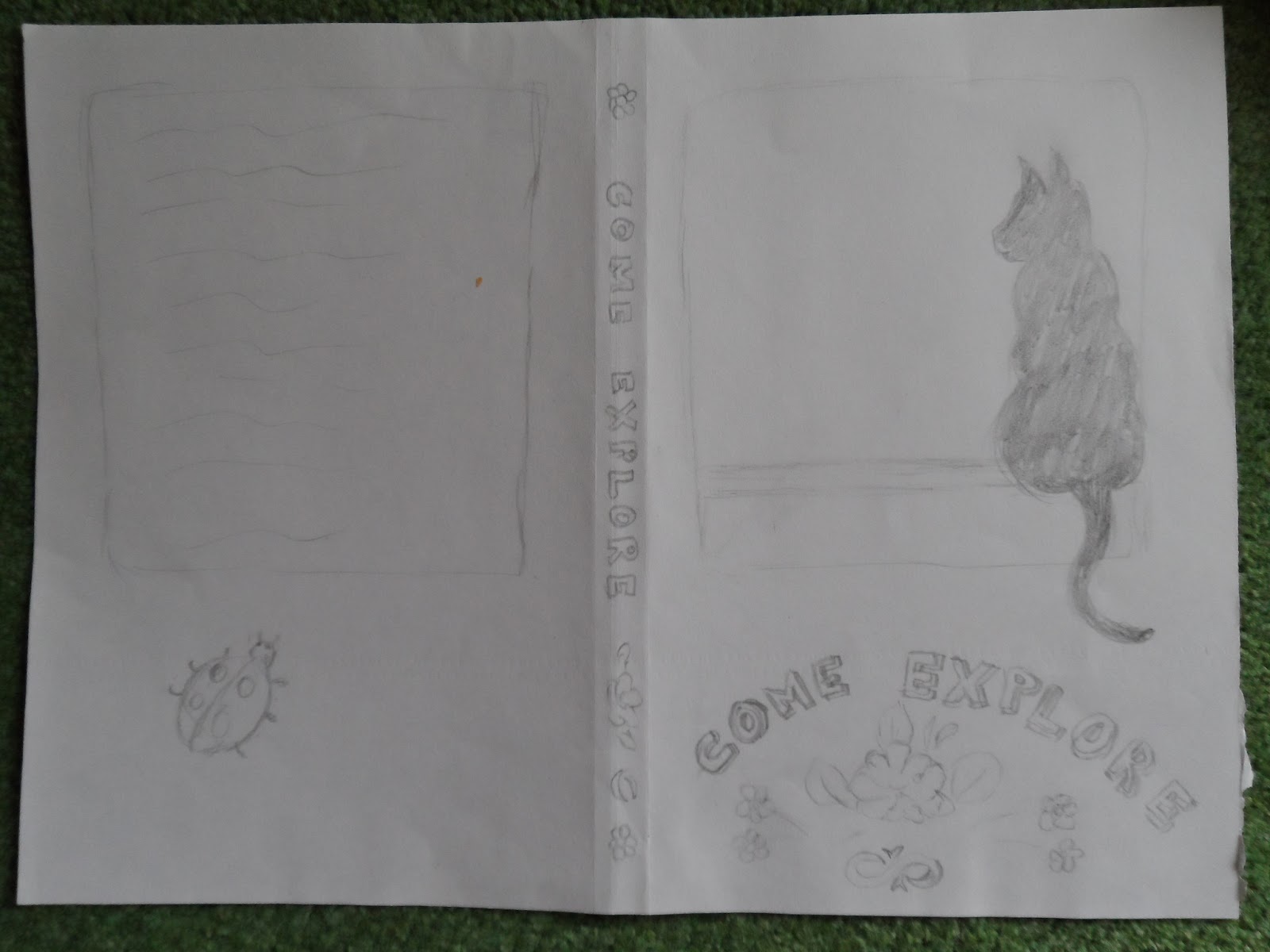
The typography of the cover title is hand rendered in the style of narrow boat art but the book blurb on the reverse side is done in Apple Casual to match in with the font inside the book.

Saturday 11 May 2013

Typography


TYPOGRAPHY


Playful typography from Coriander the Contrary Hen, by Dori Cahonas.


Sara Fanelli’s typography is mainly hand rendered and works well with her books and art work.


Below is a clever play with typography by a graphic art student from Bristol, Hannah Boland.


I have tried using my typography separate to the picture, but this did not work so well. I have therefore decided to incorporate the typography for the narrative onto the actual colour dps and add the activity suggestion behind the flap. Doing it this way gives continuity to the story and helps a younger child follow the pattern, as this is how young minds work.

When considering what font to use I have been looking for a simple font that is easy to read/child friendly and helps youngsters that are new at reading skills. The words are simple without being condescending, as children are intelligent and do not like being talked down to.

At this stage children would most probably still have adult support in reading and as the activity is outside the home they would definitely have adult supervision. I would also add a warning page at the start of the story, especially as canal walks should always be accompanied by an adult/responsible person.

I am looking at this font as a possibility or one very similar as I think the simple 'a's and 'g's work well in a children's book.

Berlin Sans FB Demi  

‘a’   ‘g’


Friday 10 May 2013

Cover page


Here are some preliminary sketches for my cover, using the canal boat books borrowed from the library.


I have used the canal art on my front cover as this is a very familiar sight on our canals. I mimicked the type of typography used on the lettering on canal boats as the title of my cover. This brings in the whole theme of the canal and is also a bright eye-catching cover that would stand out on a shelf and be appealing to children. The title Come Explore, also invites a child both into the book and to make a journey like the protagonist in the book, Sam the cat.


Tuesday 7 May 2013

Two pages in full colour.


First page...just in the middle of adding text and the flap. I have decided to add a suggested activity on the flap, 1 per DPS. The flap will cover the drake.

Here Sam the cat stops to speak to the drake, while the duck is feeding.
This is my second page. Sam sees a mouse and jumps off the canal boat to investigate. The flap will cover the mouse.

On each of the pages there are other things to spot: a buttercup and ladybird on the first page and a poppy, dragonfly and pigeon on the second.

There will be an information page at the back, which would give a little information about the plants, animals and minibeasts that are featured throughout the book.

Typography will be added on Adobe Illustrator. I am considering a simple san serif font as this is easy for the younger age range that I am aiming my book for. 5-6 year olds.

Thursday 2 May 2013

Further development of my DPS


 Lift the flaps ideas on the first double page spread.


 Ideas for additional pages: How to make a model of a canal boat with card and use this to keep some of your findings from your canal walk.


Ideas of things you can find on your canal walk and what you can do with your finds when you get home.


More ideas of things to do on your walk. eg. taking a sketch book with you, take a camera, rubbings using crayons etc.


Books I used for reference for my second double page spread.


Adding colour to the first pages.

Tuesday 16 April 2013

London Book Fair

 Here are some of the interesting books that I saw at the fair. I liked the new ideas in them. They must take a great deal of designing!

This first one was one of a series. 3D Explorer, Oceans.
 The pop-up scenes had see through layers which added a unique extra dimension to them, making them very enjoyable for children.

Lots of information on each page, but not overloaded. Good clear and accurate illustrations to making learning fun and exciting!

 Good follow through linking each page, yet different enough to hold interest.


Here was a lovely book with a magnifying glass and including slides. The book also featured flap ups. Very good illustrations as well as lots of interesting facts!

 This was a really magical book of The Nutcraker. With the opening of each page there was movement in the illustrations. The little girl dancing and the fight with the rat!


Here were some digital apps linked with books. A lot of them were linked in with schools learning.

Some of them were more appealing than others. Some did not really add much to the book other than using it digitally.


This one was a straightforward reading one.


 Jigsaw and stickers, linked with the book. All learning aids.


This book had some amazing pop-ups by renowned paper engineer Anton Radevsky! They were very intricate and would keep the attention of a reader.


This book was so beautifully illustrated and the page design complimented it very well.


Some fun pop-up books...


A pop-up carousel book, a lovely idea for young children; as when its open and the covers tied together it forms a lovely carousel scene!


This book is to be released in October and is by Grahame Baker-Smith, whom I mentioned in my first post. Baker-Smith is a Greenaway Medal winner. The book is a modern fable of Winter's magic. When Tom wishes winter would never end, he meets another boy who shares his love of snow and ice. Playing together every day, Tom hardly notices that spring doesn't come - until he realizes the terrible effect the delay is having on the countryside and his sick grandma. His friend is Winter's child, and for the seasons to go on the friends must say goodbye until next year.


Here was an interesting extra of a playable doll with a book.

Below is the book she comes with.